15 Mistakes to Avoid on Your Tourism Website This Year
In my travels, helping tourism operators and destinations create engaging, results-focused websites to meet their business objectives, I see many website mistakes. Mistakes that can severely limit the potential of a website.
Let's go through a few of the common ones so you can self-diagnose your own website. Awareness is the first step, and my hope is that you can identify some quick wins so you can make sure your website is earning its keep.
It's a longish read, as there's a lot of info to cover. I recommend you tackle one at a time, so bookmark this page and come back as needed!
1) "Everyone" is your ideal customer
In today's time-poor world, many different screens are competing for the attention of your customers. Therefore, to wisely invest your marketing dollars, you must get laser-focused on WHO your ideal customer is.
I highly recommend starting out with this excellent article, Ideal Customer Profiling: The Process of Identifying your Most Profitable Prospects, from our friends at Tourism eSchool.
When you're clear on your ideal customer, it's time to design a marketing plan to connect your business with those ideal customers using marketing solutions that work.
2) There's no clear path to purchase
So you've found your ideal customers and attracted them back to your website. Great!
Now what?
Now it's time to put yourself in your customer's shoes, and get inside their head as well! You need to understand what their needs are, and how your website is going to help them get to the answer they're looking for.

For example, as a tour operator, you might offer a once-in-a-lifetime experience to your customers.
Their main need might be they want to tick your experience off their bucket list (and of course, brag to all their friends on social media that they've done it!).
So when they land on your website, rather than presenting them with dozens of menus and buttons, your job is to intentionally lead their journey from "I'm not sure how I can make this experience happen" through to "That's it! I'm booking this now because all my questions and uncertainties have been answered".
By being intentional about the path visitors should take through your website, you'll be rewarded with bookings and enquiries from your ideal customers.
3) Your site is mediocre on a mobile
The debate about the importance of mobile is well and truly over.
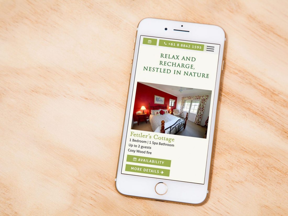
A mediocre mobile experience isn't going to cut it in 2018 when more people will likely use your website on a mobile device than a desktop or laptop computer. That's been our experience already, based on the data we've seen across our client's websites.
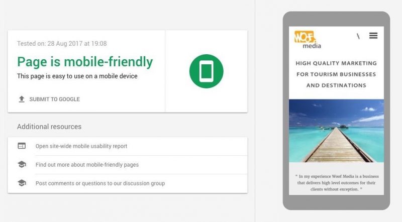
Google use mobile-friendliness as a key factor in mobile search
In the last few years, Google has actively prioritised mobile-friendly websites in their mobile search results. Their recent search algorithm updates have downgraded the rankings of websites that aren't mobile responsive, as well as prioritised mobile usability factors like font size and space between buttons.
Try checking your website with Google's Lighthouse tool to test for common mobile issues. Or, try a couple of our favourites, WebPageTest and GTMetrix.
4) You're settling for poor photography
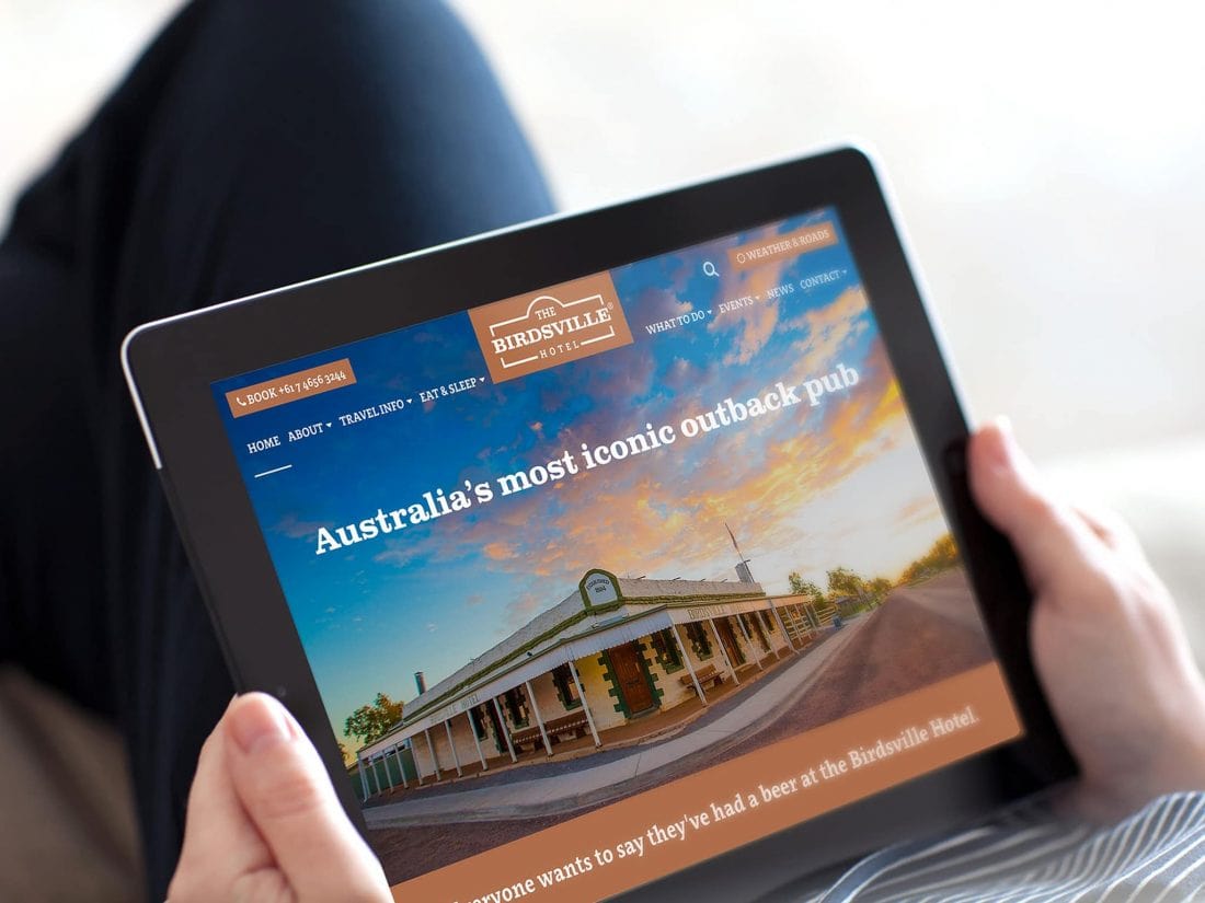
Your visitor experience is amazing, but your website is filled with photos that don't do it justice? If that's the case, your website visitors are likely to leave as you didn't inspire them to stay on your site.
Great photos and video are the perfect way to build a the bridge between awareness of your product and becoming a customer. Put simply, they inspire your website visitors to take the next step.
It's really important to optimise your photos for mobile too. No one has the patience to watch your super high resolution photo load one row of pixels at a time (or pay for the mobile data bill)!
See number 12 for tips on optimising your website images.
5) Your…website…is…slow…to…load…
Google has been prioritising fast-loading sites in their mobile search results for some time, and now Facebook are following suit.
This means if you share a link to your website on Facebook, but your site isn't optimised for speed, then Facebook is less likely to show that link to your audience.
Facebook says, "With this update, we'll soon take into account the estimated load time of a webpage that someone clicks to from any link in News Feed on the mobile app…if signals indicate the webpage will load quickly, the link to that webpage might appear higher in your feed."
When the two main players in search and social media make mobile speed a priority, it's wise to make sure your website stays in their good books!
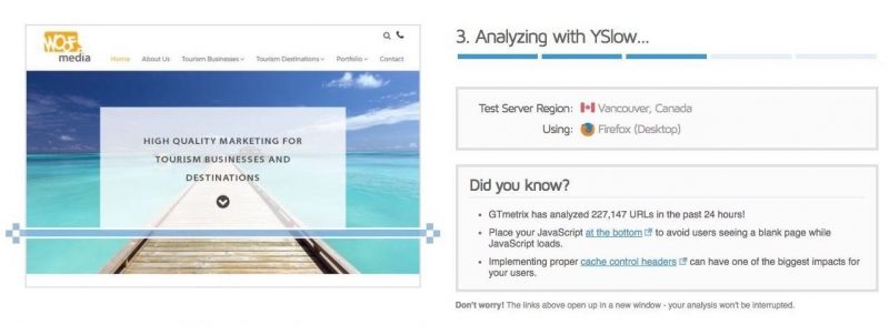
Test your website loading speed from different locations with these free tools:
The three most common website speed-killers we see are:
- cheap domain and web hosting (also see #9),
- images that aren't optimised (also see #12),
- the use of "all in one" website templates that try to fit everything under the hood "just in case you might need it one day".
6) You have no analytics installed
Would you employ a 24/7 sales person but never measure their performance? Hopefully not!
Don't let your website off the hook. It's there, working hard 24/7 to bring customers in your door. But unless you're monitoring performance, perhaps it's not doing everything you hope it is.
Google Analytics is free and should be installed on every website so you can access all the essential metrics like number of visitors, locations, which pages they visited, how many times your phone number button was clicked and more (much, much more!).
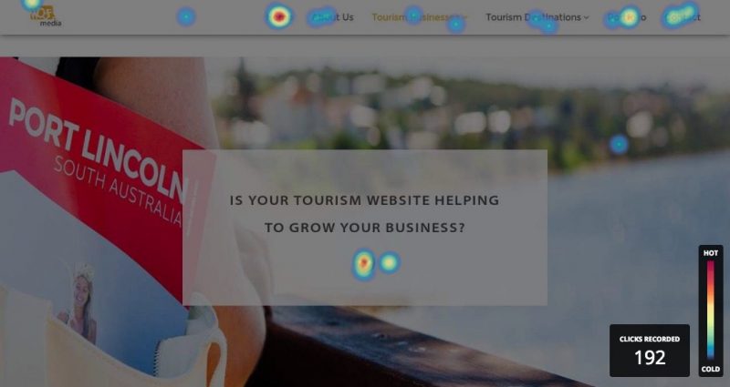
To take things to the next level, monitor and record visitor behaviour on your website with a tracking tool like Hotjar. Insights, like the below heat map, show activity from real people using your site and help you make better decisions about design and content changes in the future.
Already have your site managed by our team? You already have access to these tools and we can enable them for you at any time.
7) Design is a nice-to-have, not a priority
Does your design tell a potential customer you're a quality business that cares about them enough to provide a great website experience?
There are two keys to website design. Each supports the other.
Cosmetic Design
Cosmetic design is the visual experience. The fonts, colours, use of space, changes in style when visitors hover over a menu or the way buttons interact with clicking or tapping.
Quality and consistency in your design gives your visitors the confidence that your website is a deliberate part of your business, not just an afterthought. If you don't already have a brand style guide in place, consider speaking with your designer to develop one to ensure all your marketing material looks great and is always "on brand".
Information Design
Information design, or information architecture, refers to designing the way visitors move through your website and making sure you have the information laid out in a way that helps, rather than hinders.
For example, it's better to show relevant frequently asked questions in context, right near the booking section of your tour page rather than on a separate, hard-to-find page in the menu. The same applies to your testimonials.
"After all the statistics and calculations are formulated, the one element that breathes life into marketing is good design."
~ Steve Jobs
8) Your website isn't secured by an SSL certificate
You'll no doubt be familiar with that little green SSL padlock in your web browser when you visit your banking website.
SSL certificates increase trust for your visitors, have speed benefits for your website, and are widely believed by SEO experts to be a "ranking factor" used by Google.
Since January 2017, Google have added warning messages in their popular Chrome web browser to flag insecure, or non-SSL, websites who are accepting information from their visitors.

The take home message is a simple one: every modern website should be secured with an SSL certificate.
Since late 2016, we've included the installation of SSL in every new tourism website we build. It's also included free with our managed website care service. This way, our clients can focus on running their business rather than constantly looking over their shoulder at Google to make sure their website is compliant.
9) You're settling for low quality domain and web hosting
If one customer per month loses patience and leaves your website because your web hosting is slow, then was that never-to-be-repeated $10/month hosting deal really worth it?
With domains and web hosting, you absolutely do get what you pay for.
One of the hidden traps with cheap web hosting is the companies often pay less attention to security. We've rescued a number of websites from malware and hacking incidents where cheap hosting companies hadn't kept their systems up to date, leaving their customers vulnerable.
Assuming you're happy to spend time managing the technical side of your website, security, backups and maintenance, we highly recommend VentraIP in Australia.
If you have better things to do with your time, and your website runs on WordPress, then our fully managed website care service might be just what you're looking for.
10) Your website doesn't support your offline marketing
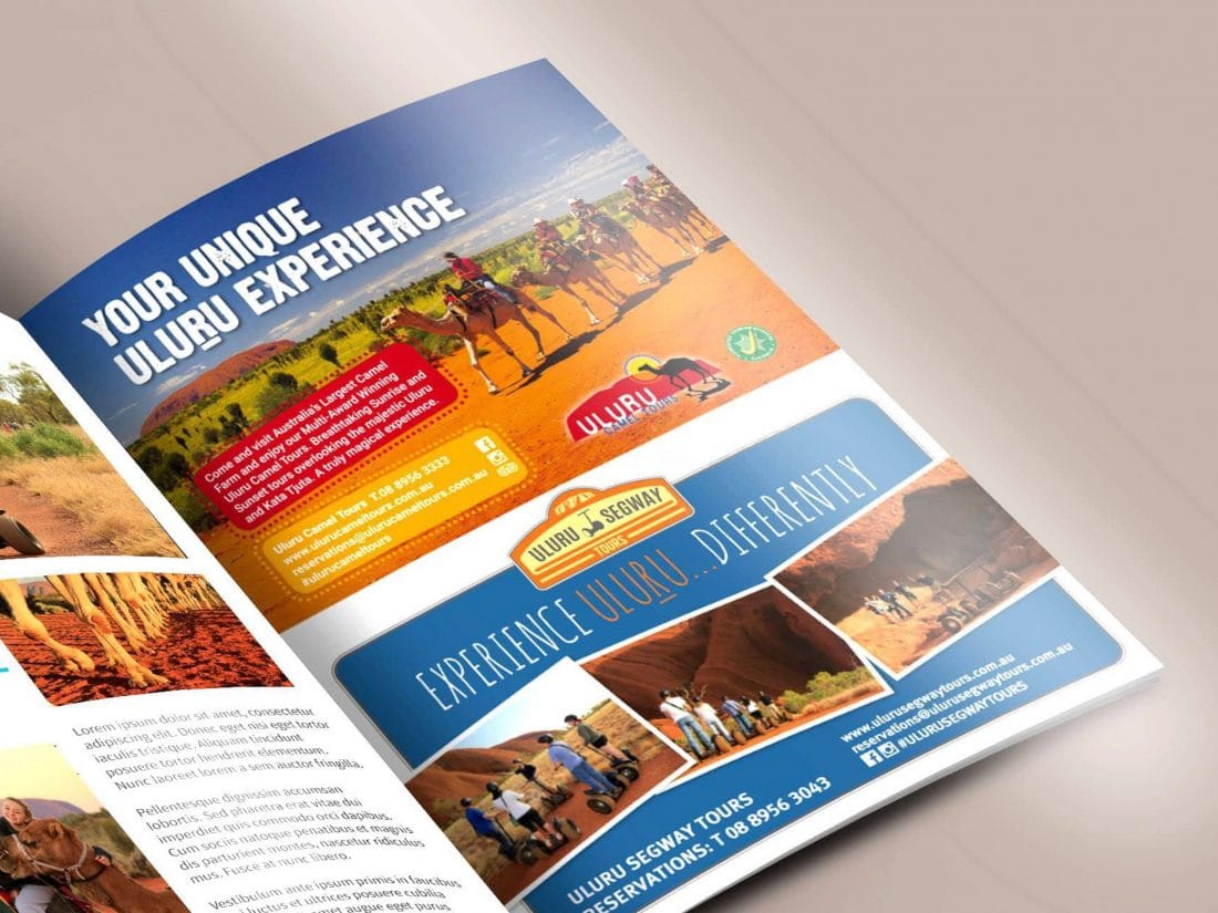
While not all tourism marketing activity occurs online, your website is often the first place visitors go after seeing your offline print advert, brochure or signage.
As mentioned previously, it's important that you provide a consistent, on-brand experience as customers move between your marketing materials. At no stage should they have cause to doubt they're looking at the same quality tourism business.
PS There's definitely no shortage of opportunities to advertise your business offline, so next time you get that call from the salesperson, ask these critical questions to make sure your marketing budget is well spent.
11) You wrote all your website content
Writing your own content is perfectly fine if you're a wordsmith and have skills in writing, editing AND optimising content for the web.
But if you don't have those skills, it's worth asking the question "Should you write the content for your website?".
The written word, or copy, is critical in creating a positive emotional response in your reader. Paired with the right images or video, great copy can make your tourism experience rise to the top of the online choices available to your potential customer.
"When people go to a web page, the thing that they want more than anything else is instant clarity."
~ Ken McCarthy, Copywriter
12) You haven't optimised your images
Large, poorly optimised images are one of the biggest speed killers for websites. But, you can't very well have a tourism website without great photos can you? You could I guess, but I doubt it'd be very effective!
Here are a few of the techniques we use on every website we build to make sure images load as fast as they can.
BEFORE uploading the images to your website:
Resize your image to the maximum size needed
Usually a maximum width of 2000 pixels (px) is a good starting point, but check with your web designer if your site has specific requirements. We recommend sizing all of your images to 2048 x 1536 and then resizing from that as needed. Why that size? That's the current size needed by the Australian Tourism Data Warehouse (ATDW) and also a good size to use for large banner images on your website.
Save your files as JPG, 72dpi and 65-70% quality, with a file size of 300-500kb if possible. If you're engaging a professional photographer, let them know these sizes and they should be be able to supply a copy for you, along with the original high resolution versions.
Pro tip: even after resizing, optimise your images even further with a tool like ImageOptim (Mac) or Caesium (Windows).
Change the image file names using appropriate descriptive words
Instead of IMG0001.jpg, name the image red-sand-dune-outback-australia-0001.jpg.
Firstly, it will help you search and find that image in your website image library later on. Secondly, having those extra descriptive words will help search engines index your images, helping your site get found.
Pro tip: often your photographer will supply images named like IMG-0001.jpg. It's good practice to keep the "0001" in the image filename so you can easily search for it later and remove/replace it. For example, you're only allowed to use the photo for a limited period of time, or one of the people in the photo didn't sign a model release form and you only find out after it's been loaded on your website.
AFTER you've uploaded the images to your website:
Update the title and ALT text
The title and ALT text (what is ALT text?) are important for website accessibility (e.g. sight-impaired people who use screen readers to navigate the web). Plus, they help Google understand what your site is about.
Use descriptive language. Your objective is to describe the picture in a way that you don't need to see the picture to know what it is. "Toyota Landcruiser on red sand dune near Birdsville" would be useful ALT text.
For more, check out Google's guidelines for image publishing.
Ensure your website uses correct image loading techniques
Check with your web designer to make sure your website using the latest coding techniques to load the right-sized image for the screen your website visitor is using. This means if you're using a smartphone, your website will be clever enough to load a smaller sized copy of the image instead of the largest one meant for big screens.
Use a Content Delivery Network (CDN)
A CDN helps you by storing copies of your website content at strategic locations around the world.
So if your website is hosted in Australia, but your customers are checking you out from Canada, then they need to send your website back and forth across the Pacific. Not so great! With a CDN, they'll be loading a copy of your website from North America so it will be much faster.
Speak with your web designer/developer to make sure your website is using one.
13) You're not using search engine webmaster tools
Google's free Search Console is every webmaster's friend, as are Bing’s Webmaster Tools.
But despite these being essential tools for website management, we've found too many businesses who either haven't had these setup, or haven't been aware of the information in them that can benefit their site performance.
Some of the other really useful information you can find in these tools are:
- Actual search terms your site is appearing for and your approximate rank
- Monitoring page errors, like the dreaded 404 Page Not Found (fix these to improve visitor experience)
- Sitemap management to make sure search engines have the latest updates to your website
- Mobile testing tools
Setup and management of these important tools is one of the many tasks we take care of for our clients when their websites are launched and managed using our website care service.
14) You're still using meta keywords to "SEO your site"
Please, please don't!
This has been ignored by Google since at least 2009, yet we still find websites being built today that have these loaded up with keywords. If your web designer or developer is still recommending you use this for SEO, you may need to send them the above link!
While it's very important that your website is well-structured and technically sound for SEO, worrying about technical optimisation for SEO before figuring out your ideal customer is like trying to tile the roof your house before you pour the slab and build the walls.
So when you ask "How do I rank my website on page one?", you'll find my response will often be "Who is your ideal customer?" before I ask "Do you have a H1 tag in the right place on your website template?".
"But Peter, tell me the best SEO tactic for tourism websites"
Well ok then. Assuming you have the technical foundations sorted, the number one tactic I believe you should use is to simply research and answer the questions that your ideal customer has.
There are several free tools available to do some very quick market research on the actual questions your ideal customers are asking.
The best offline tool is the customers who call or email you questions about your product!
And one of the best (free) tools online is…Google.
Yes, you can literally ask Google to tell you what people are actually searching for.
Let's say you're a café in Brisbane's Southbank. Head to Google and start typing "best places to eat in brisbane".
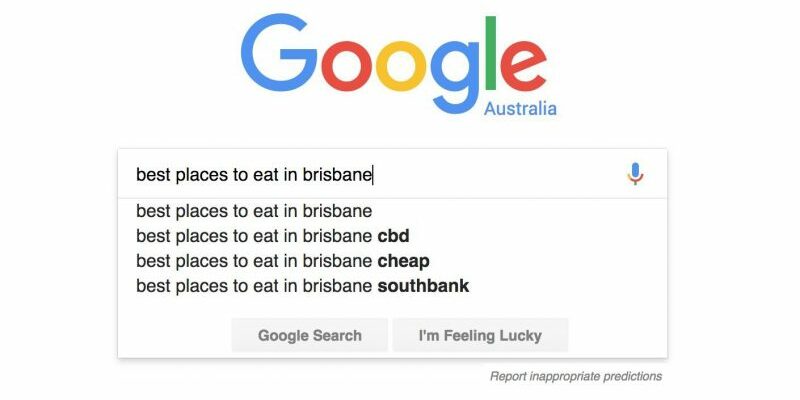
See those extra search phrases below the one you're typing?
That's Google predicting what you're looking for based on ACTUAL searches from real people.
To use that information to help your ideal customers, you might write and publish a really helpful article for your website titled "Top 10 Best Places to Eat in Brisbane's Southbank". Then, when you share it on social media, you tag the other nine places in your post, along with the local Visitor Information Centre, tourism association and so on.
Hopefully, some or all of those will now share your article. That's free PR for you, plus extra links back to your website that Google will likely pay attention to. Over time your little article might well be on the first page of Google when someone types in the search above.
Of course, there's more to it than that, but hopefully that will spark some inspiration for you.
Along with Google's autocomplete, you can get a full list of search terms that your website is appearing in from Google Search Console. You can also try another favourite free tool of mine for keyword research, Answer the Public.
15) You're going it alone
From collaborating with other businesses to package complementary products, to working with your local tourism association or RTO to familiarise people with your offering—tourism truly is a team sport.
And working on your marketing is no different.
If you're trying to do everything yourself, there will most certainly be a limit on how far you can go. That's not to say DIY doesn't work. It can and it does.
But at some point in your business journey, you'll have to make a choice whether you're going to invest your valuable time into building a wonderful tourism experience for your ideal customers OR spend your time becoming a digital marketing specialist.
What we love the most is working side by side with passionate tourism operators and destination marketers who are truly great at what they do. By taking care of the marketing they need, but simply don't have time to do well on their own, we both win.
And win-win is the way business should be don't you think?
Share this on Social Media
Contact us to discuss your digital marketing challenges
For a limited time, I'm opening up my calendar to help you make headway with your digital marketing challenges. Request your complementary 15-minute call today.

