Website: Bridestowe Lavender Estate, Tasmania
The background
Bridestowe's website had been a trusty resource, ecomm shop and tour booking centre for seven years. We built the site in 2016 and at the time, it boasted all the top CX functions and content features of the era. As time marched onwards to 2024, consumer behaviour, device sizes and speeds, and expectations had evolved. As well, Bridestowe itself had launched new products and tours and even expanded from lavender by purchasing a huon pine range called Linii. Bridestowe's trusty site had more than paid for itself during its eight-year lifespan and it was now time for WOOF Media to build its next iteration.
More than just a website
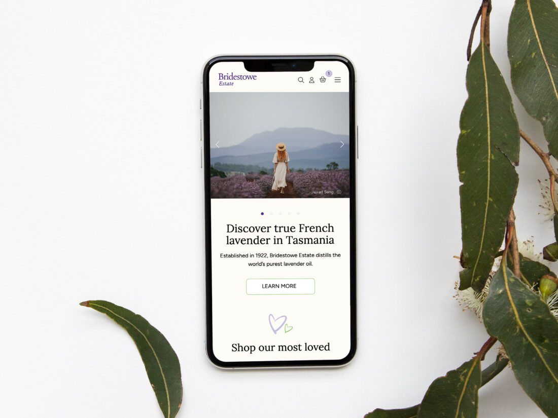
Aesthetically, Bridestowe wanted a fresh look for the brand: a modern look but not trendy; timeless but specifically "not granny". The premium quality of the products needed to be communicated with a nod to the love story which underpins the entire history and culture of Bridestowe Estate.
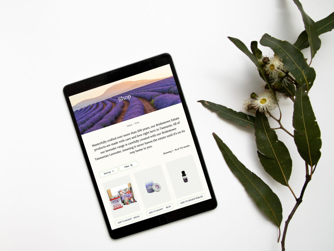
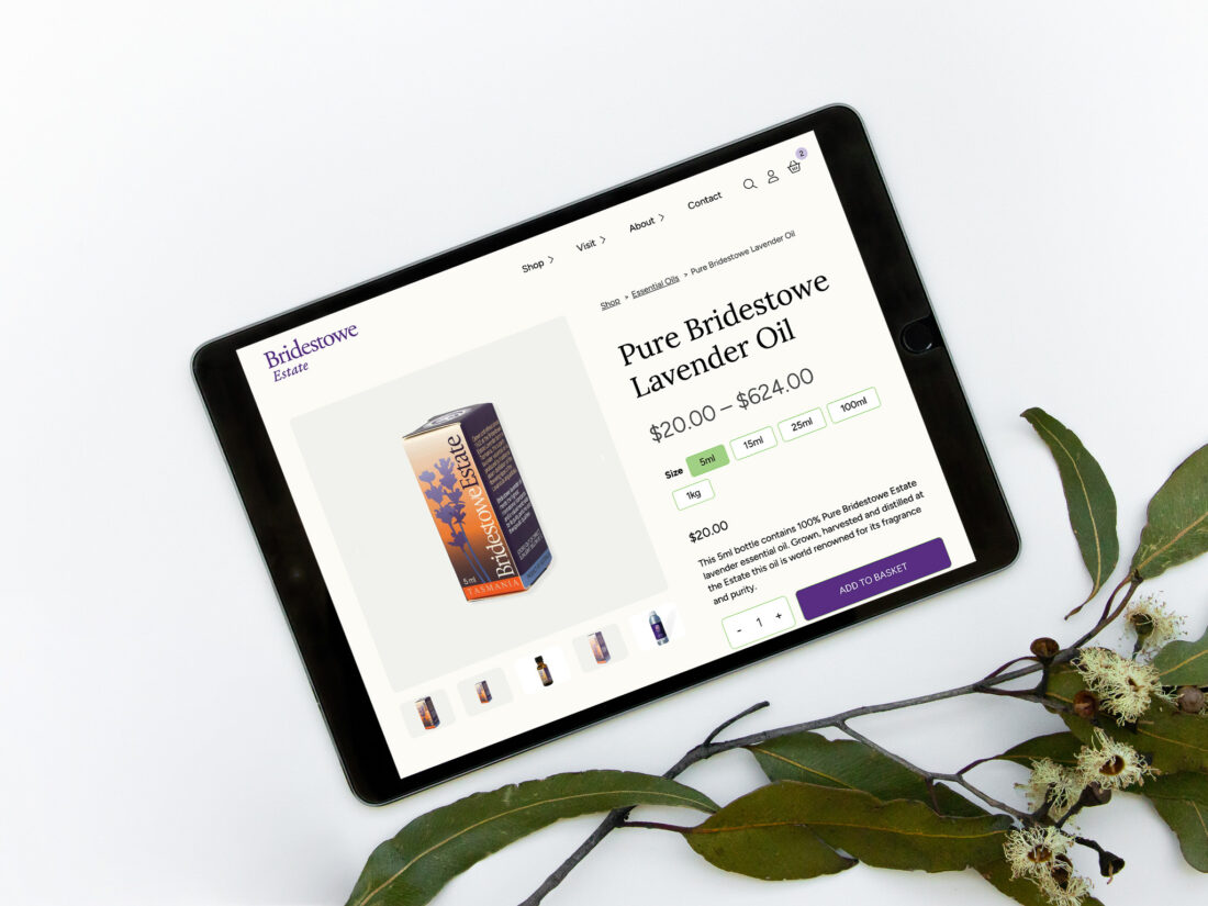
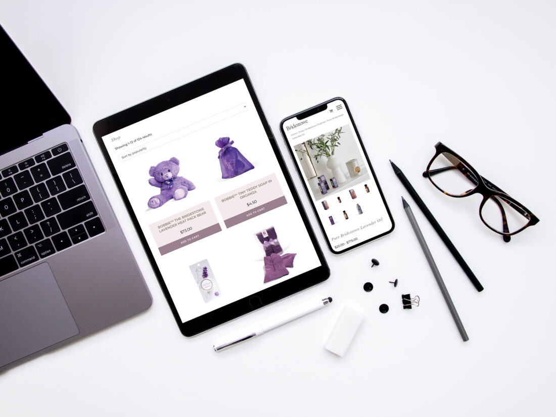
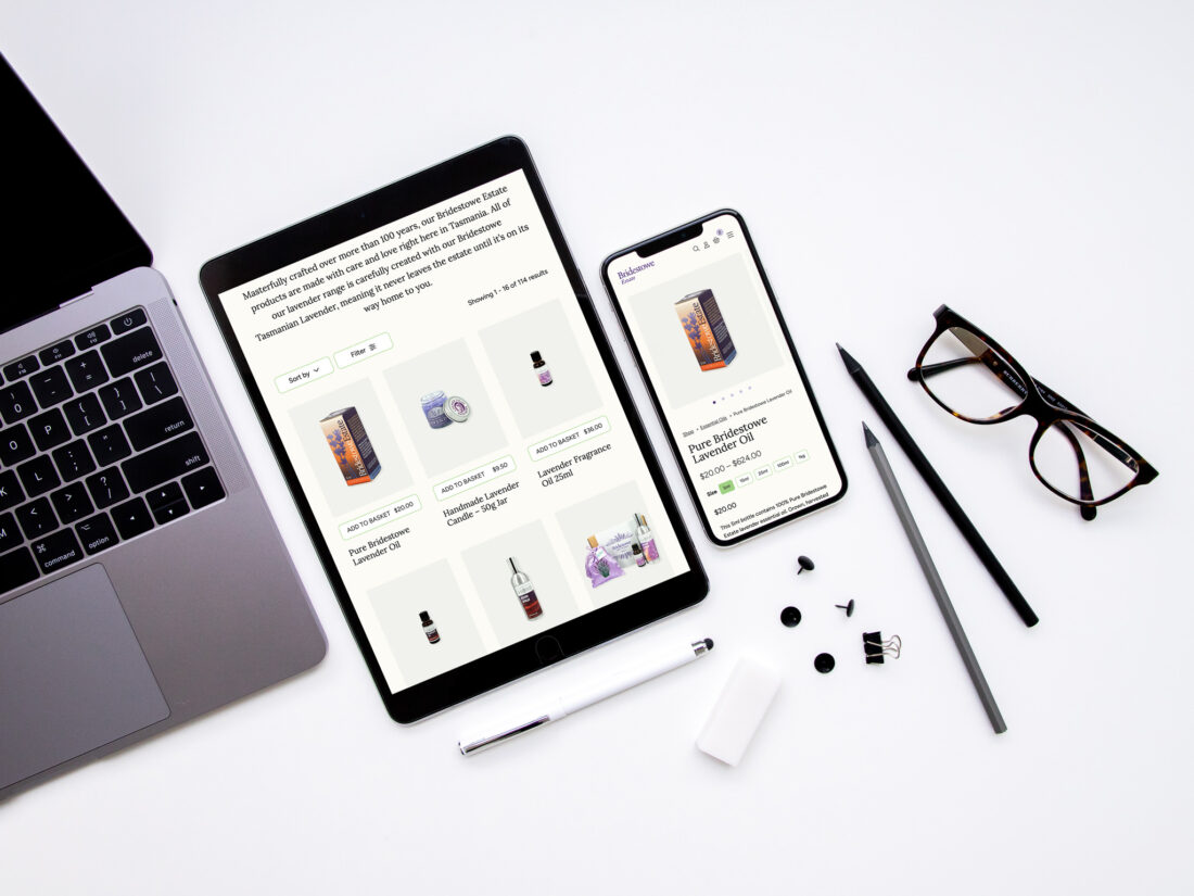
On an operational level, Bridestowe's ecommerce customer base was growing each year alongside heightened consumer expectations for information and imagery. The team at the farm also needed flexibility to quickly add, remove or edit products themselves, including editing and uploading images.
The project planning process was lengthy. The carefully interlinked system of inventory management software, payment processing system and shipping apps needed to sync together instantly. The estate's tourism activities such as ticket purchases, tour bookings and event calendars, cafe menus and other informational elements needed the utmost support, since their premises hosts tens of thousands of visitors each year. Last of all, we needed to factor in a decade of order history, analytics configuration (across Google Analytics, MailChimp, WooCommerce) and data management. Bridestowe Estate's website is one of the largest and most complex websites we've ever tackled.
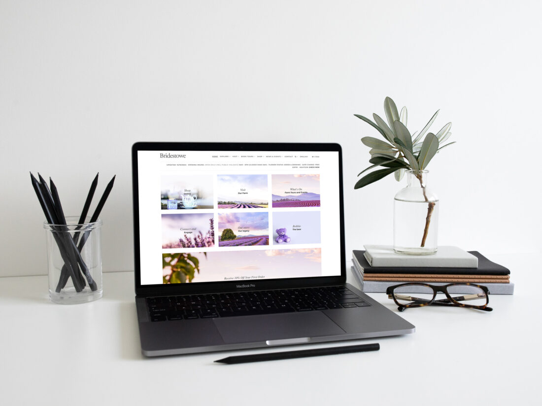
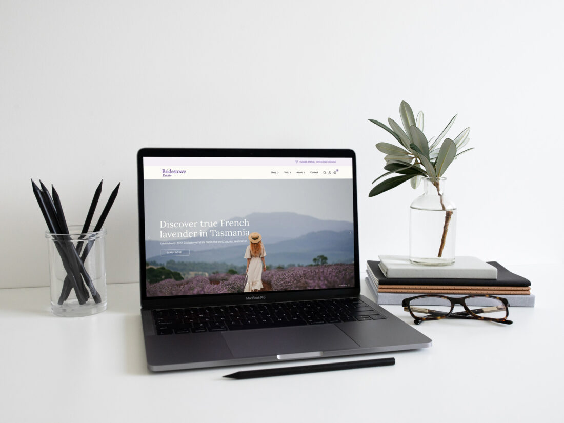
Before and After: 2016 to 2024
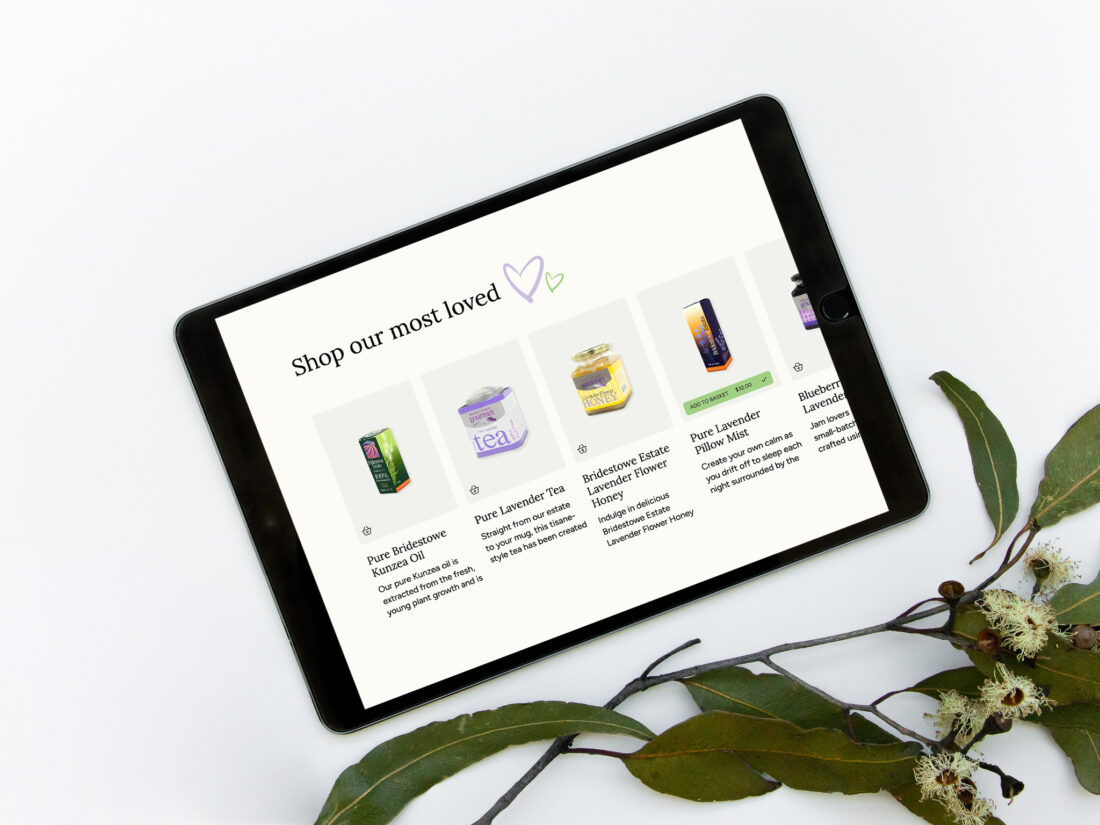
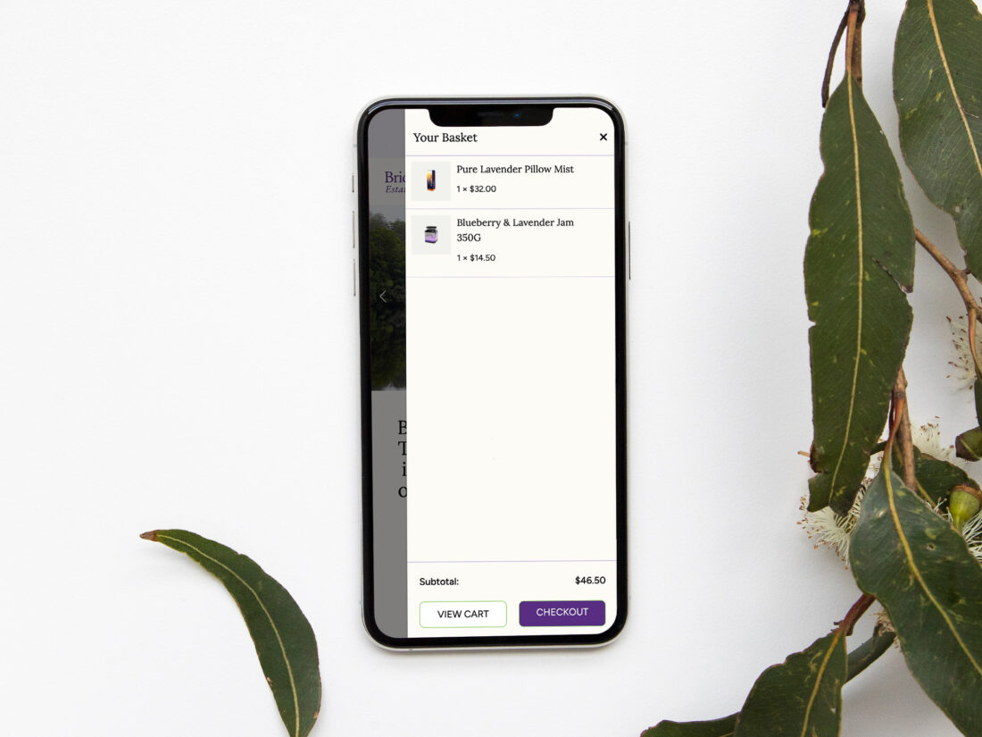
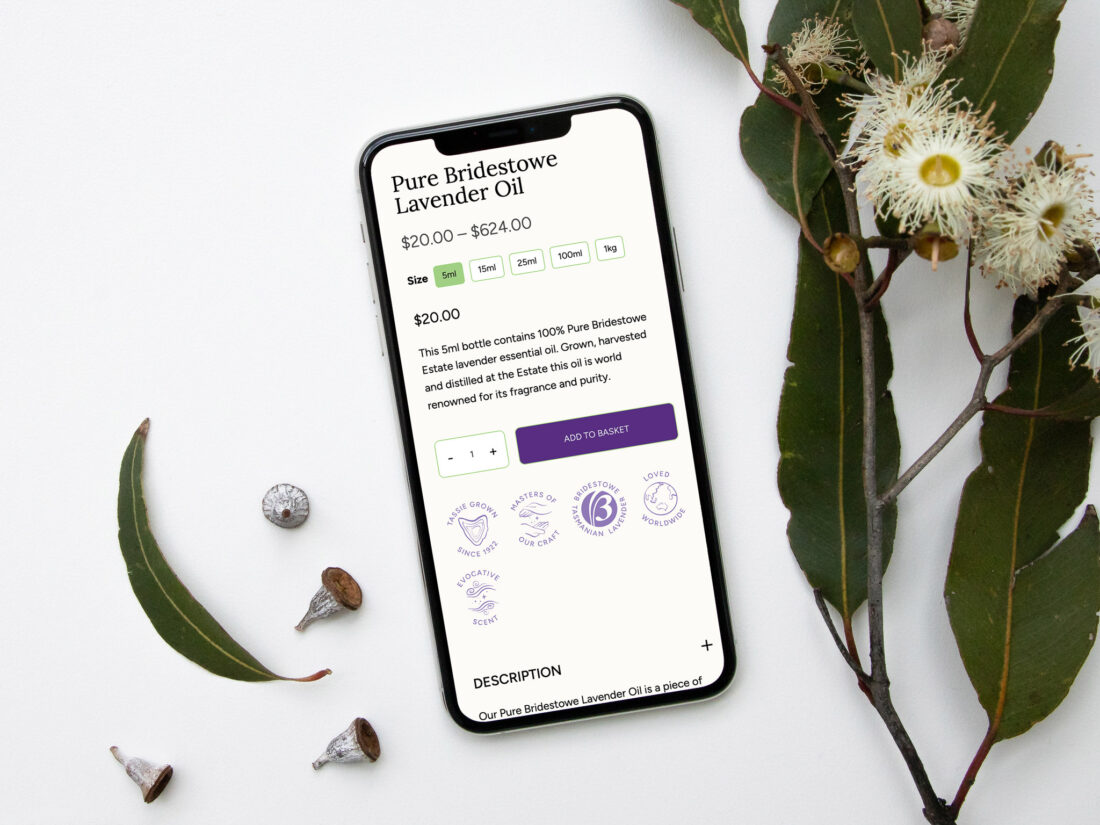
The new Bridestowe Estate website takes inspiration from other farms who have transitioned into leading online retailers. Add-to-cart buttons on the homepage, more detailed product descriptions made approachable through accordion-style dropdowns and a newly streamlined navigation all make the site faster and easier to peruse.
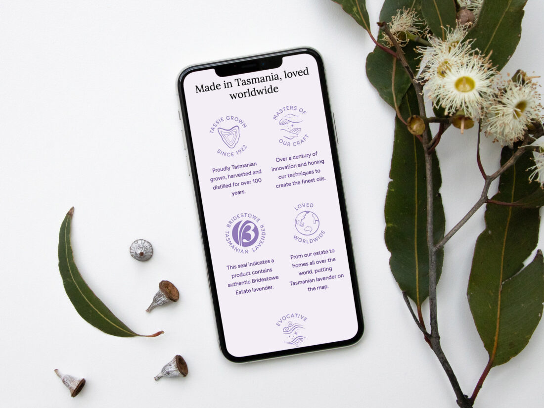
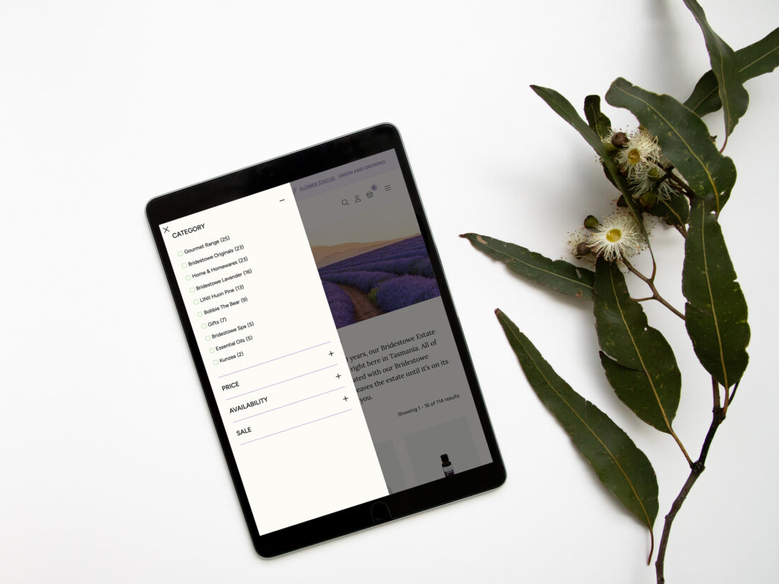
The design of the site has been refreshed with a new colour palette, a set of icons which correspond to key brand pillars, and a warmer background for each product image.
Most importantly, we finally had a chance to solve a communications issue which has plagued the onsite farm team for years: what colour are the lavender flowers. Every year, guests who haven't taken note of the season arrive to find green buds or harvested plants. Now, a ribbon across the very top of the page states "Flower Status" with a simple and clear colour description.
Since launch, the enhanced CX has worked its magic - by three weeks post-launch, average daily sales had increased 267%.
Since launch our sales have increased by over 100% compared to the same period last year. You guys have really delivered.
Case Study
Find out how we helped a 100-year-old agribusiness prepare its digital marketing for international success.