How Branding Makes A Difference
A Story of Dish Wands & Branding Woes From Our Account Director: Amelia.

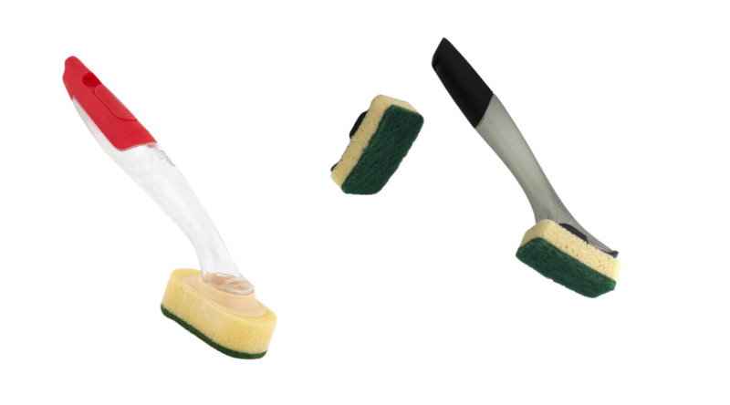
These dish wands drive me insane. It's something that's bugged me for a long, long time and now I need to vent about it here, on my workplace's blog which is ostensibly about regional tourism.
The reason? They are the best, most obvious reason for why branding is so important. Look at them. Do you know which one I use? Of course not, I don't know which one I use and I've been using this thing for years.
Every time I buy new sponges for the wand, I have to go check what brand it is and put it in my online order, immediately, before I forget once again. If I'm in the supermarket, I just buy a new wand rather than risk buying the wrong sponge replacements.
You know what would save me a lot of time? BRANDING. Some little hint that makes it extremely easy for me to rebuy the replaceable sponges without any heartache. They need to take a leaf out of Scrub Daddy's book.

At WOOF Media, we teach our clients the timeless principle that a brand is more than a logo; it's the sum of all the touchpoints that are the totality of the guest's experience with you.
There's the visuals, the tone of voice, the photography style… you've heard of all those from a style guide.
And there's the way a phone call is handled, or the checkout experience, or how a complaint is resolved. Getting all your touchpoints right and all of your team members on board, makes it so much easier to remember, repurchase and recommend you.
So, in the case of these dish wands, yes - both brands have logos already. I can't tell you what either looks like despite years of interacting with their product category.
I mean, logos are standard bearers, not blaring sirens, so they can't be relied upon to help me. What these don't have is a way of remembering them. Two extremely similar products made up of unremarkable colours and similar parts, yet no one has ever thought to do something helpful like, say, a bright pink lightning bolt across the sponges. A colourful motif (could be a logo, could be a holographic duck - just make it memorable!) on the brush head that I see every time I use it.
I mean, just look at Scrub Daddy, there's no questioning that bad boy.
I've worked on more brand projects than I can remember: brand strategies, brand updates, full rebrands. For everything from destinations and tourism operators to a think tank, two aviation companies, banks and jewellery stores.
I have some strong opinions after doing so many.
Such as, if your name is not obviously the product/service, then make your tagline descriptive.
Or, don't use lots of colours in your logo because it gets so expensive to screenprint or embroider on merch.
And please, please, never skip brand strategy because you'll end up like this town and waste six months arguing over extremely similar logos since you haven't first decided who you are.
When we work with clients on their brand strategy, we deep dive into the business and its customers to build a clear foundation that informs all the brand identity components.
Our designers are terrific at ingesting this information and creating purposeful and carefully crafted ideas for a visual identity that makes life easier for your target consumer.
Think:
-
Branded gift tags for Coonawarra Experiences, which runs tours through wine country.
-
Giving every guest a branded drink bottle and backpack for use on the tour, as is the case with Australian Air Safaris. Not only are these useful but guests see your brand name over and over, every single day of the trip, plus the merch ends up in guest photos!
-
Illustrated maps, which answer questions you already know your customers will ask you, like at the Innamincka Hotel.
So there you have it. Don't be like the forgettable dish wand proprietors, people. Be like our clients, who give their customers a range of helpful reminders of who they are.
Blog Written by Amelia, WOOF Media Account Director

